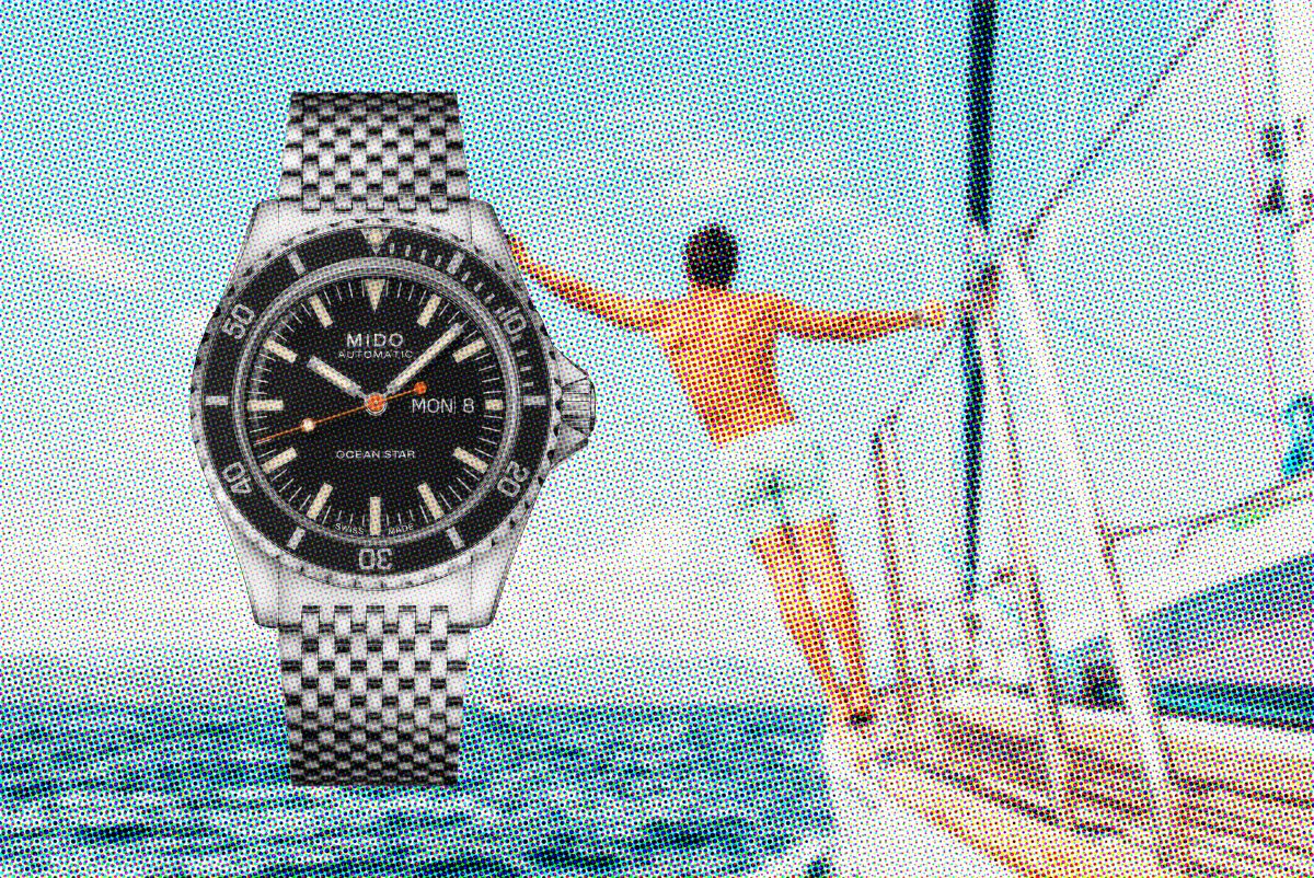
In 1959 Mido released the Ocean Star line of watches with a completely novel monocoque case design, pressure fitted crystal, cork crown sealing system and…
Category: On Design
A brief timeline of waterproof watches

In 1927 Miss Mercedes Gleitze successfully swam across the English Channel. It was her eighth attempt. However, a rumour began that another woman had swam…
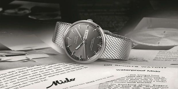
Mido, A Rich & Storied History
I’ve been on the search for a watch and made the decision to go for the Mido Ocean Star Tribute timepiece. 4 years ago my…
Brand & Watches

What can you learn about building a brand from watch manufacturers and enthusiasts? I’m on a journey to buy a watch. An automatic mechanical watch…
Hans Hartmann, classic design and Machiine

What is it about some designs that they become more beautiful as time goes on. The same could be said of some artists, and some…
The beauty of imperfect

What do Christmas, responsive css design, National Geographic and a walk in the forest have in common? The internet turns 25 and people are connecting via…
Why design matters a lot, but not the way we think!
The notion of UX design has been thrown around a lot in the web for the last few years. User experience is important, that’s easy…
Why products become classics.
Why is it that some designs become classics while others do not? Some classics were loved right from the beginning while others were little loved…